Children are out of their homes during the day. Whether they study at school, visit friends, or take a ceramics class. Parents become concerned when their kids are not in their homes, especially when they don't go back on time. they get stressed and begin to think that something bad is going to happen.
Parents who have kids aged 6-12 or teenagers aged 12-17.
03
User Surveys
I delivered an online surveys to 5 participants who matched the target audience to understand user motivations, needs, and frustrations. Based on the results, I was able to create users personas, which helped me design the app and comprehend the user’s needs.
75% let children start using phones from the age of 7-8
“I gave my child phone when she was 7 while she started go to school.”
60% would like to know that their child’s phone is active
“This information can be very helpful.
100% would like to know where their children are when they are alone
״As a parent, I would like to know who my child is with and what they are doing.”
75% of parents want to receive updates about their child’s feeling when they are away
“I would like to know if he is feeling well and nothing bad has happened to him.”
04
Competitors
In my market research, I focused on three popular applications that all had the same goal. My analysis focused on their features as well as what solutions they provide for solving their users' pain points. Then I made a comparison table to see what was there and what was missing that could improve the experience and solve the problem more effectively.
05
Persona
In order to better understand the pain points and needs of the user, I created a persona based on the results of the survey
06
Architecture Information
The architecture of the app was defined based on the insights gained from the research. I use this step to validate my solution before moving on to visual wireframes.
As soon as I completed the information architecture, I began building the prototype. first, I created preliminary sketching of all the screens - from the onboarding to the main screen. Secondly, Making a characterization based on the sketches and tightening it to accurate level.
08
Visual Screens
The main goal in the onboarding was to make the user feel comfortable so that he would want to use the app. For me, it was crucial that he solve its pain points as soon as possible. Therefore, I decided that he needs to add his kids at this stage in order to move to the main screen. Thus, he has already shortened the process and can see his children on the map.
Onboarding
The main goal in the onboarding was to make the process as smooth as possible, so that the users would like to use the app. For me, it was crucial that they will get to the solution immediately. Therefore, I decided that they would ask to add their kids right at this stage in order to move to the main screen. Thus, they have already shortened the process and can see their children on the map.
Main Screen
The Main screen allows the user selecting specific kid and follow him in real-time, or open the history drawer and view at recent locations the kid was in the last 24 hours by moving the slider.
Profile
The profile screen shows the kid's battery life, internet connection status, voice status, and GPS connection status. in addition, the user can customize the notifications, open the kid's phone camera or send an alarm to make sure the kid is fine
Adding Locations
This option is useful when kids are in specific places like home, school, etc. The user simply needs to name the place and select the symbol that will appear on the map
Chat
Other than finding the location of the kids, users can send a massage or make a video call with them
Navigation
The navigation feature allows users to go to the kid's location by using Apple maps, or any other similar app.
09
Design System
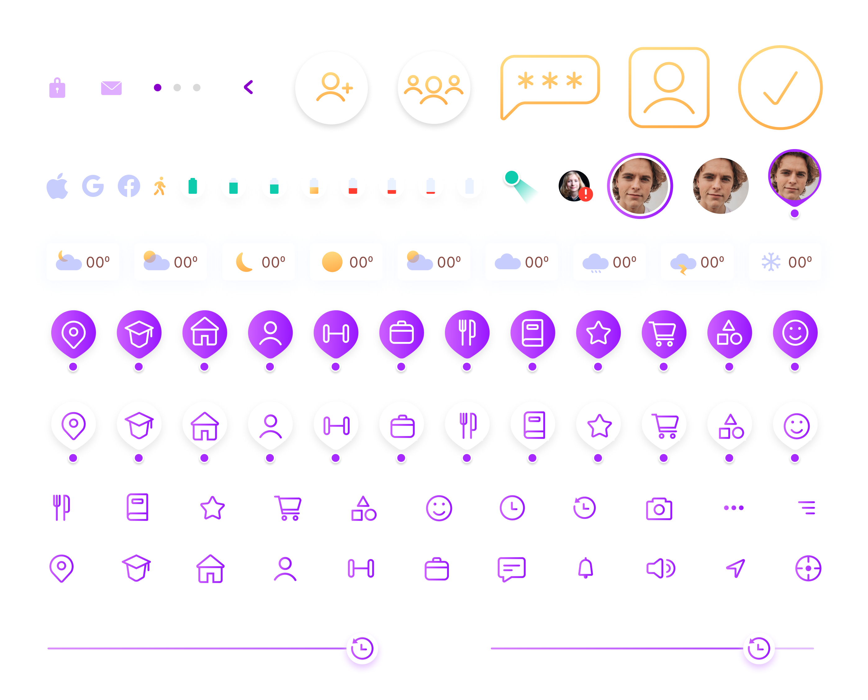
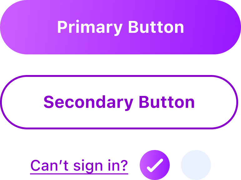
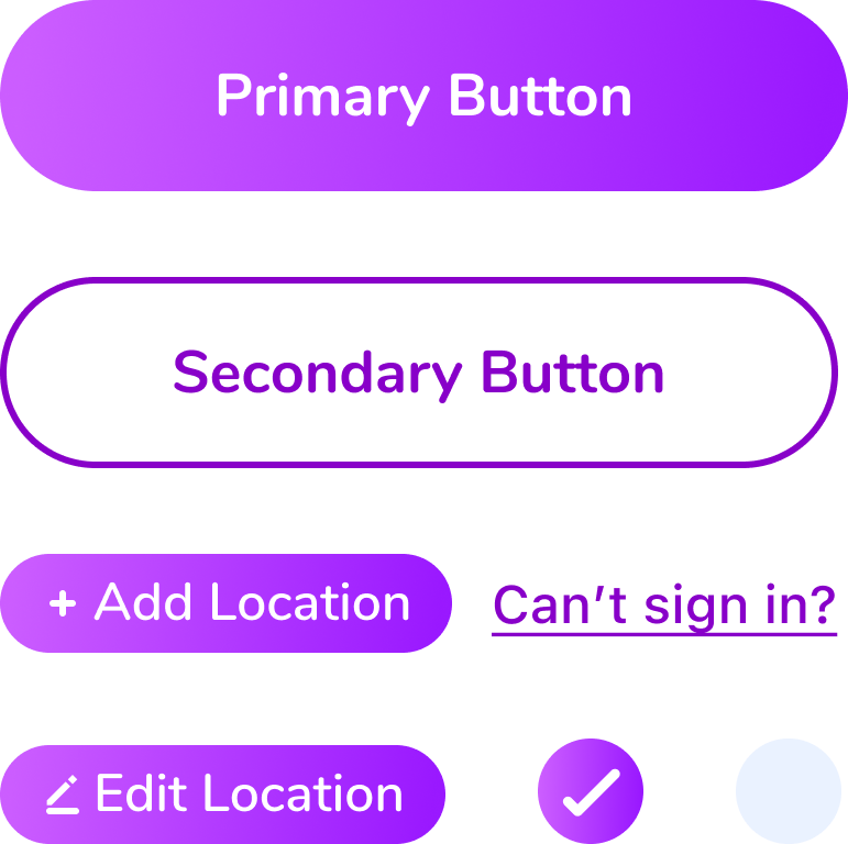
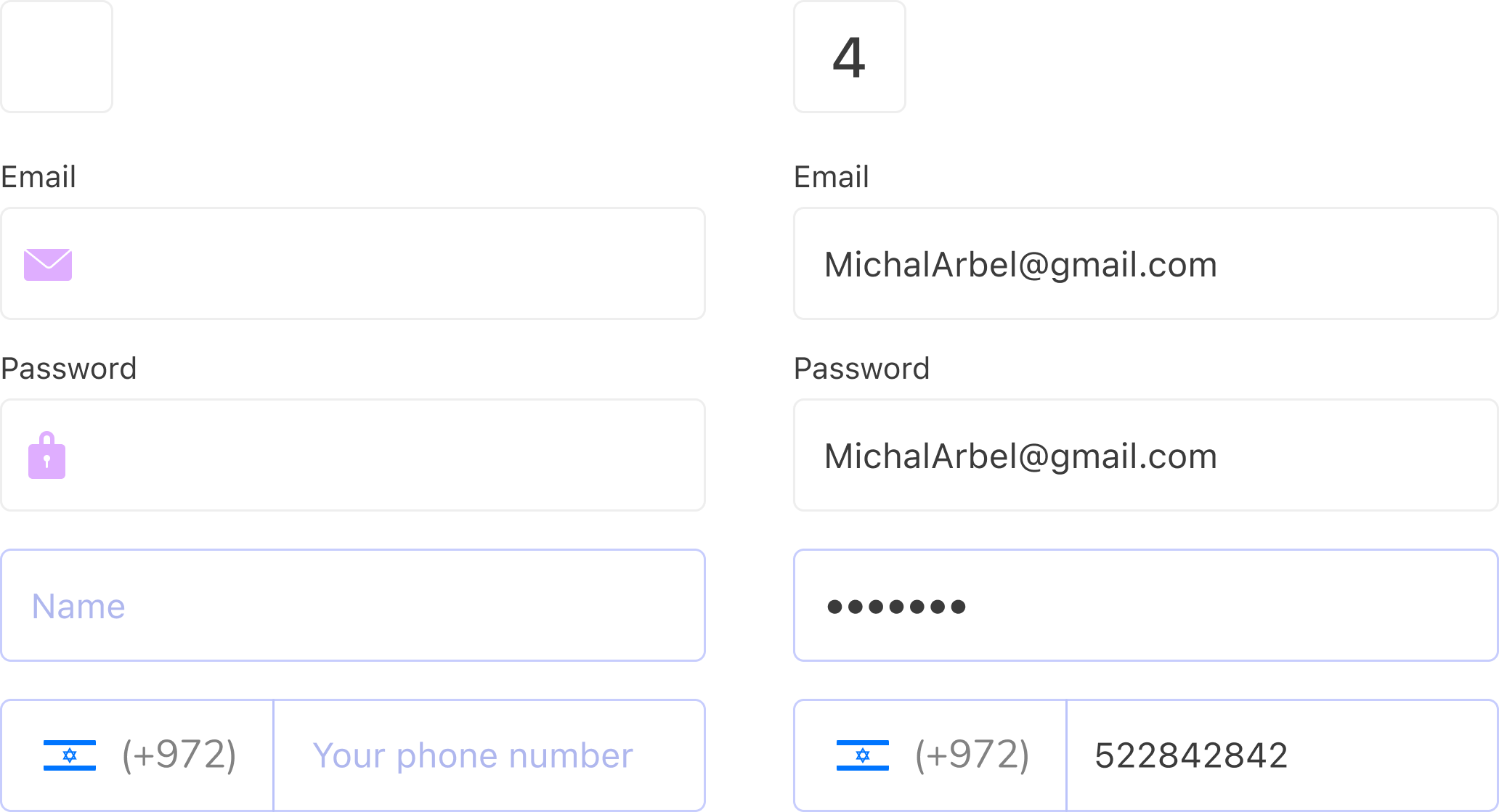
Components and user interface elements were used to create the design system to quickly replicate designs. In this way, we don't have to reinvent the wheel, which reduces the risk of unintentional inconsistency
Typeface


Icons & Graphic Elements


Buttons & Checkbox

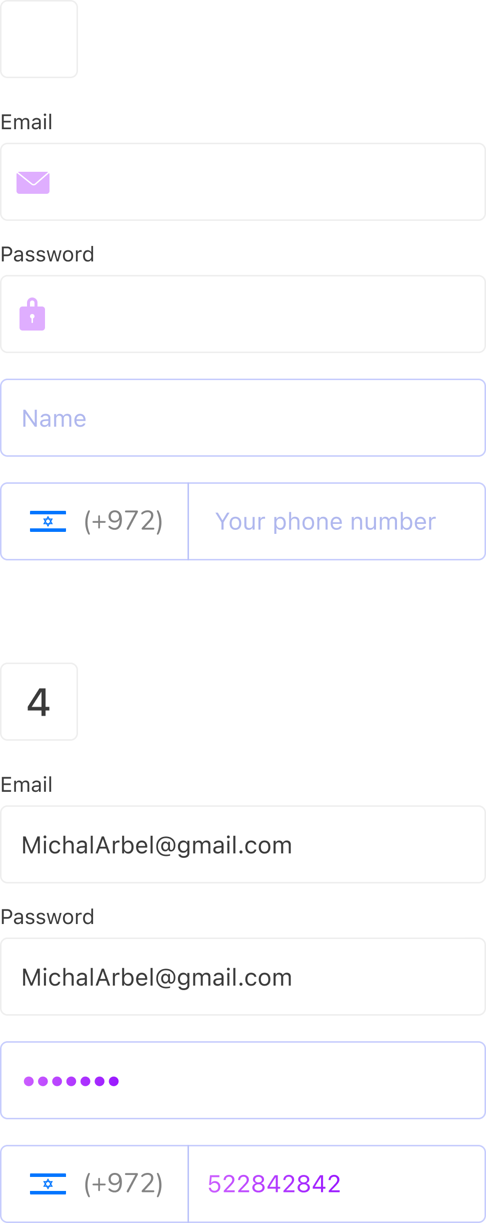
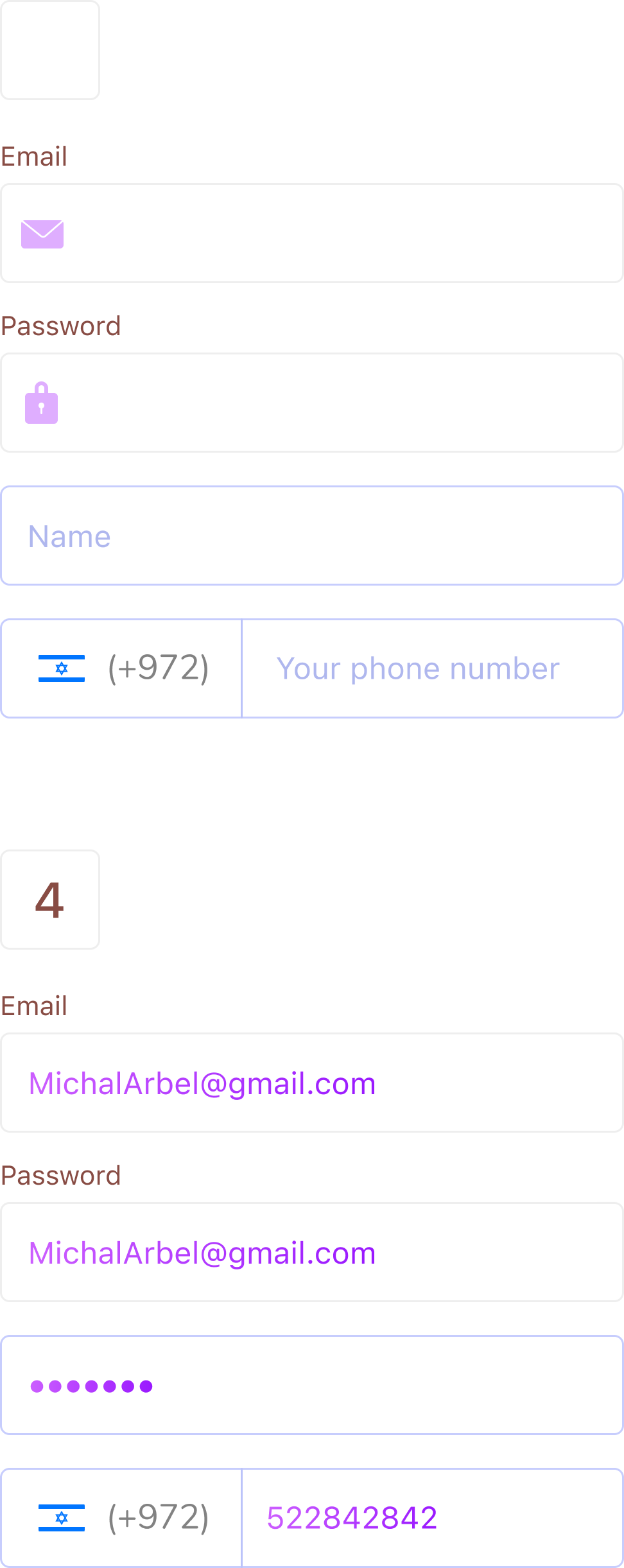
Text Fields

Textinput

Buttons & Checkbox

Icons


Messages & Alerts
052-2852-841 | yuvalior5@gmail.com
052-2852-841
yuvalior5@gmail.com
©2021 Yuval Lior- All Rights Reserved


